


The best abstract Chrome themes use colorful gradients, swirling paint and ink, and 3D shapes to give your browser an artistic look without distracting clutter. They are a great match if you prefer colors and patterns over photos or character art.
Here are 20 free abstract themes from the Chrome Web Store. From soft pastels to dark night-time patterns, each pick gives your new tab page a clean visual refresh.
1. Shaded Purple

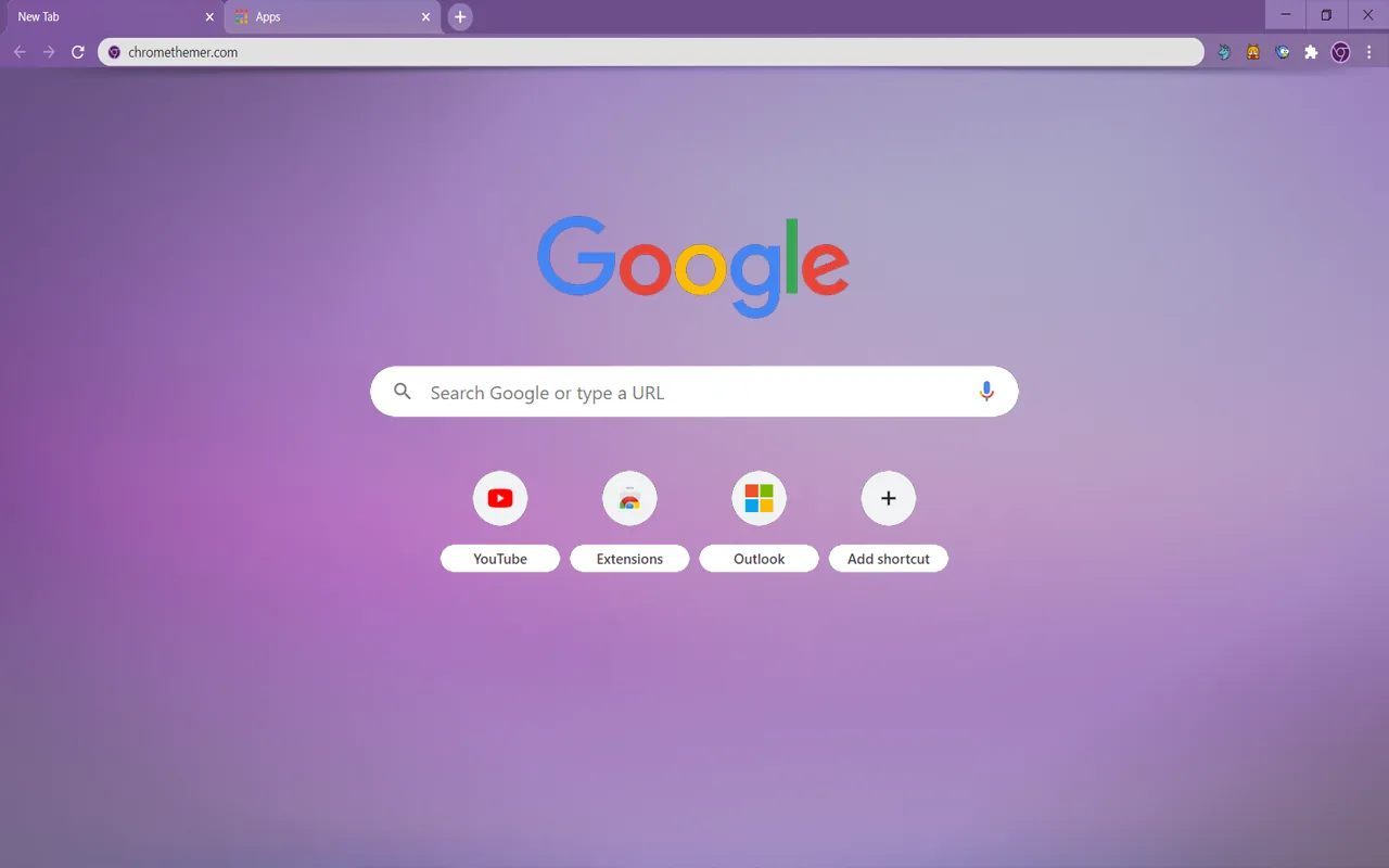
🖌️ About this theme: Shaded Purple uses a soft gradient that fades from deep violet at the bottom to light lilac at the top of the new tab page. The matching purple frame and tab bar create a clean, even border around the browser window. The layout stays simple, leaving your web shortcuts and address bar easy to see.
👍 Why we like it: It gives your browser a clean gradient look without sharp lines or heavy artwork. Active tabs stay clear and readable against the violet frame during daily work. It is a great pick if you want a calm purple theme that does not distract from web pages.
Active Users: ~100,000 users
2. Color Fusion
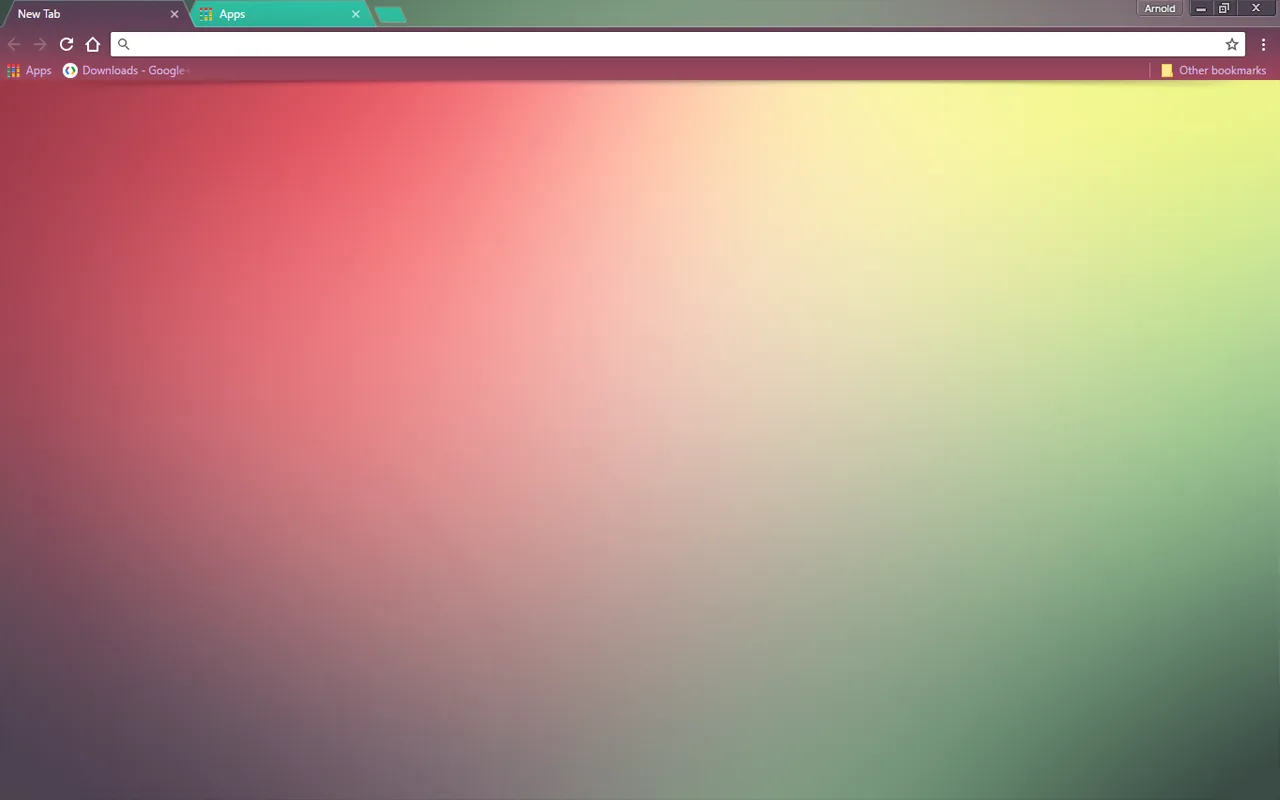
🖌️ About this theme: Color Fusion blends soft patches of red, peach, yellow, and green across the center of your screen. The warm colors flow into each other without hard borders, while the toolbar and tabs stay light and simple. The background adds warmth to your new tab page without overpowering your browser icons.
👍 Why we like it: It brings multiple colors together into one smooth, non-photographic design. The gentle color blend adds warmth to new tabs while keeping shortcuts easy to read. It provides a cheerful, balanced look for anyone who likes multi-color gradients.
Active Users: ~100,000 users
3. Sooth Gradient
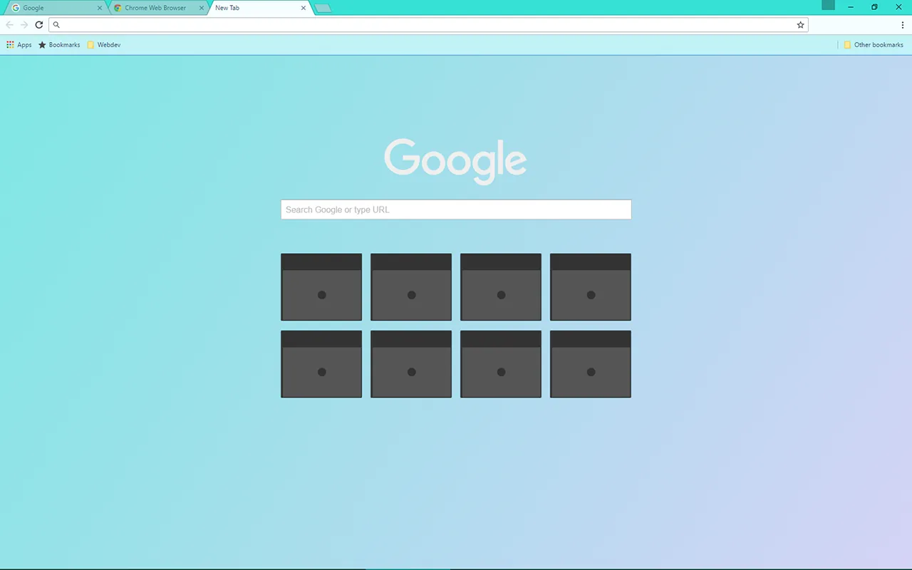
🖌️ About this theme: Sooth Gradient transitions smoothly from cool turquoise on the left to soft lavender on the right across the browser window. The top toolbar, tabs, and buttons carry matching pastel shades that tie the whole window together. The soft color transition keeps the screen bright and open.
👍 Why we like it: The two-tone pastel gradient is gentle on the eyes during long browsing sessions. Tab titles remain clear and distinct against the lavender and turquoise backdrop. It is one of the cleanest light gradient themes available in the store.
Active Users: ~20,000 users
4. Abstraction – Veda
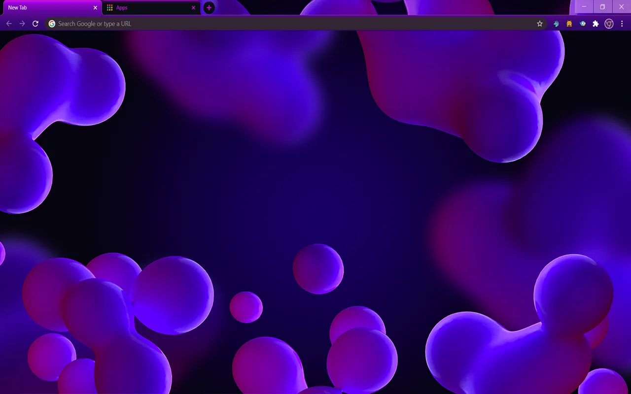
🖌️ About this theme: Abstraction – Veda features purple 3D balls and rounded shapes spread across a dark violet background. A deep plum tone covers the browser frame and top tab strip, framing your open pages neatly. The smooth shapes add depth to the new tab layout.
👍 Why we like it: It introduces a fun 3D art style that stands out from flat gradient designs. The darker purple colors keep the screen dim while keeping your open tabs well organized. It is an ideal pick if you enjoy 3D shapes and dark purple tones.
Active Users: ~10,000 users
5. Dark Harmony
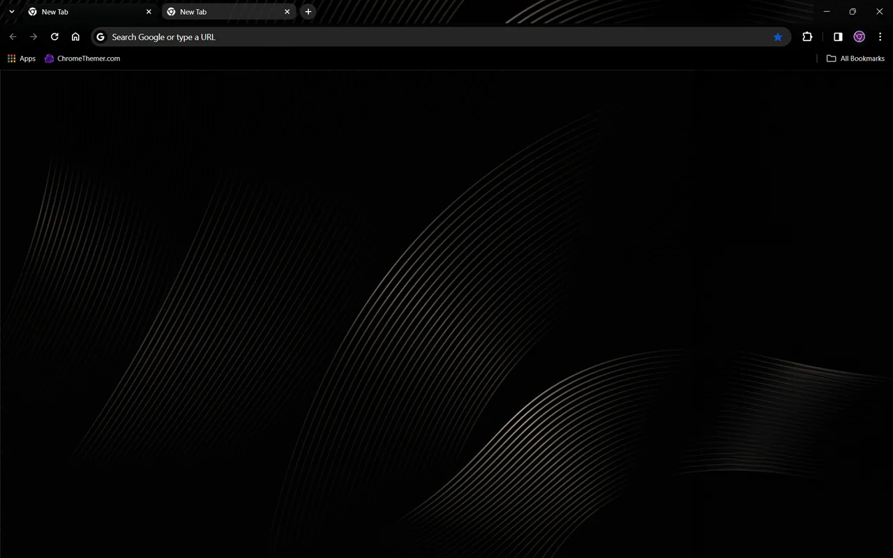
🖌️ About this theme: Dark Harmony uses a deep charcoal background decorated with thin, curving gray wave lines that sweep across the lower screen. The frame, tab bar, and toolbar use solid dark gray tones to keep the entire browser window dim. The fine lines add simple texture without creating clutter around your web shortcuts.
👍 Why we like it: It is a clean dark theme for working late without dealing with a completely blank screen. The dark frame helps open tabs stand out clearly, while the thin wave pattern stays quiet in the background. It delivers good contrast for text and bookmark icons.
Active Users: ~6,000 users
6. Holographic
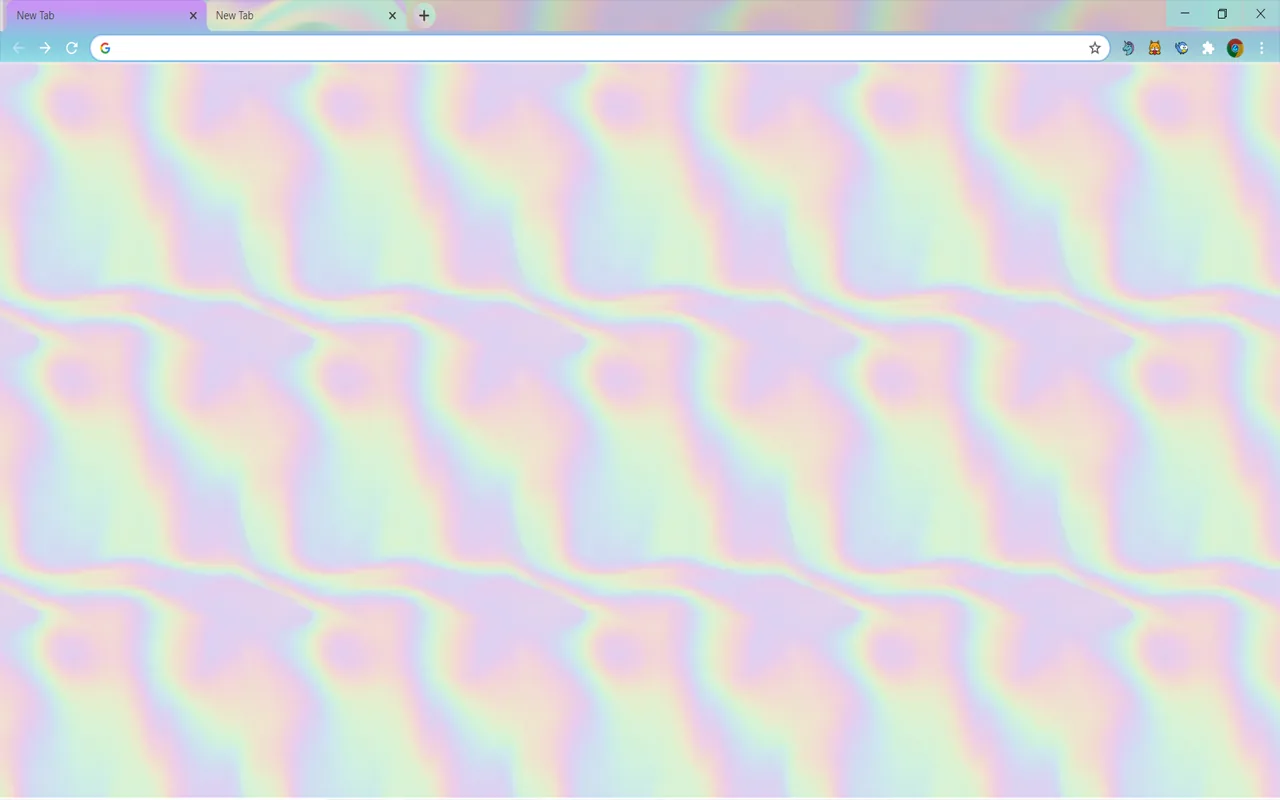
🖌️ About this theme: Holographic displays a soft foil-like pattern with folded parts in pastel pink, pale mint, lilac, and soft yellow. A light gray-pink toolbar frames the top of the window, blending smoothly into the pastel background. The shapes give the look of folded paper without harsh glare.
👍 Why we like it: It offers a fresh foil look built entirely with soft pastel shades. Browser controls and tab labels stay crisp against the pale top frame. It is a distinctive choice for users who want subtle color variety in a light theme.
Active Users: ~5,000 users
7. Pink Serenity
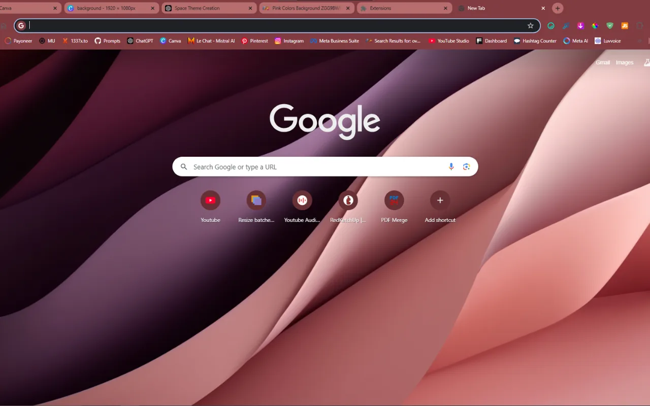
🖌️ About this theme: Pink Serenity features smooth folds of pink and mauve that resemble soft waves of cloth across the screen. A dark rose frame wraps around the top tabs and address bar, giving the browser window a defined border. The gentle shading creates depth across the center of your new tab page.
👍 Why we like it: The deep rose frame creates strong visual contrast against white web pages and open tab labels. Its wave folds look clean without relying on busy artwork. It provides a focused pink palette that feels balanced on wide screens.
Active Users: ~4,000 users
8. Color Abstraction
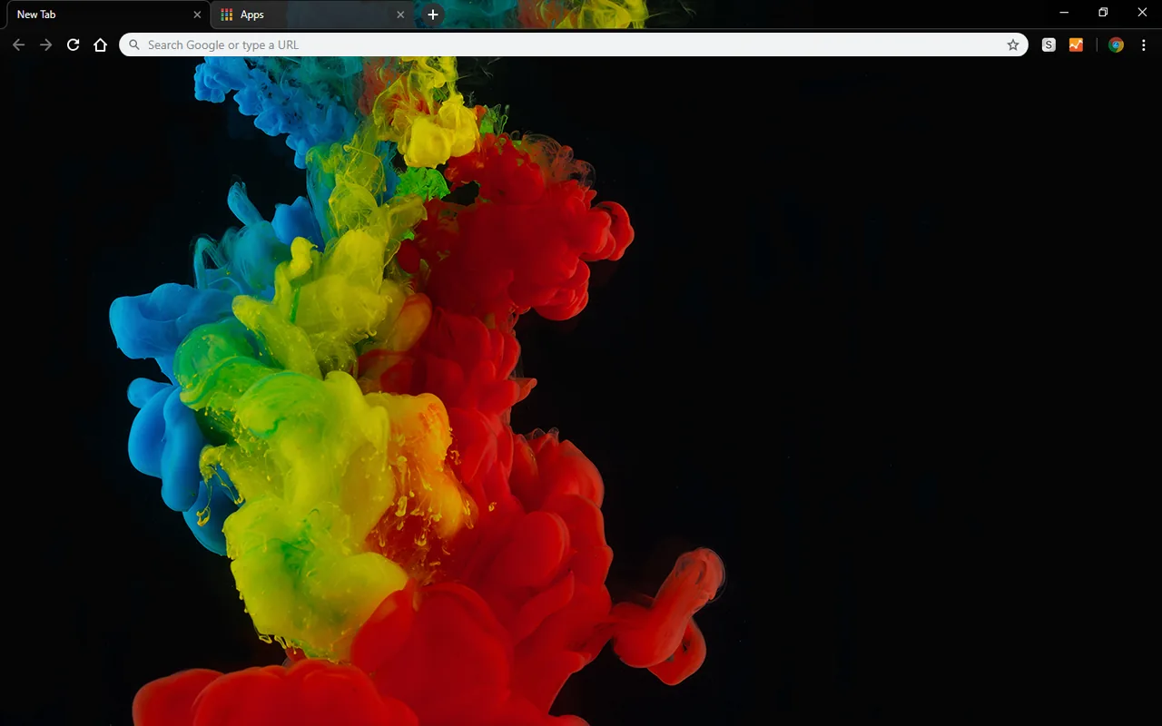
🖌️ About this theme: Color Abstraction shows clouds of red, orange, yellow, green, and blue ink spreading over a dark black background. The top frame uses solid black, making your open tabs and URL bar feel compact and tidy. The colorful ink clouds sit mainly in the center, leaving the edges clean.
👍 Why we like it: It combines a dark frame with rich colored ink, giving you high contrast without excessive brightness. The black toolbar keeps tabs easy to read, while the splash of color makes every new tab interesting. It is a great choice for dark theme users who still want color.
Active Users: ~3,000 users
9. Acrylic Watercolor
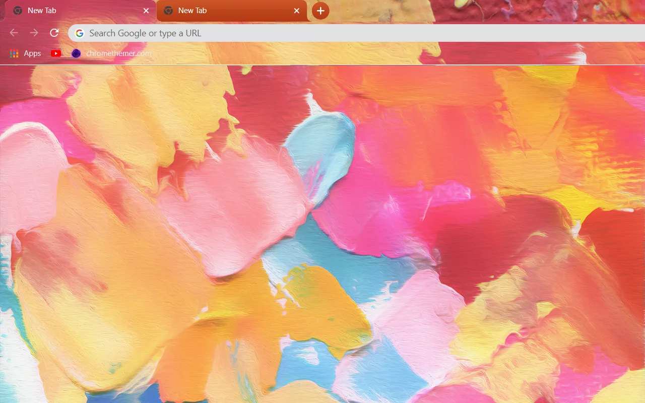
🖌️ About this theme: Acrylic Watercolor covers the new tab page in thick brush strokes of pink, peach, yellow, and sky blue paint. The top bar uses a light sky-blue shade that matches the paint marks below. Visible paint edges and layered brush strokes give the artwork a handmade look.
👍 Why we like it: It brings the look of wet paint and broad brush strokes straight into Chrome. The cheerful color mix brightens up daily browsing without washing out search tools. It is a great fit for anyone who loves visible painting textures.
Active Users: ~2,000 users
10. Liquid Gold
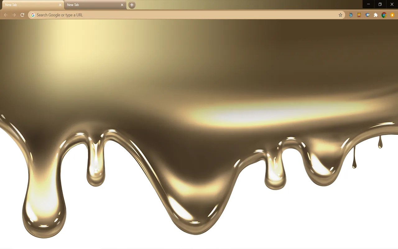
🖌️ About this theme: Liquid Gold features streams of metallic gold paint dripping down from the top of the screen onto a plain white background. The browser frame and tabs use a warm honey-gold shade that connects with the drips below. The lower half of the new tab page remains clear and white.
👍 Why we like it: Placing the dripping gold paint at the top leaves the center of your screen open for bookmarks and web searches. The warm gold toolbar looks distinct from standard gray or blue themes while keeping tabs easy to read. It gives your browser a creative paint look with lots of open space.
Active Users: ~2,000 users
11. Watercolor Blue
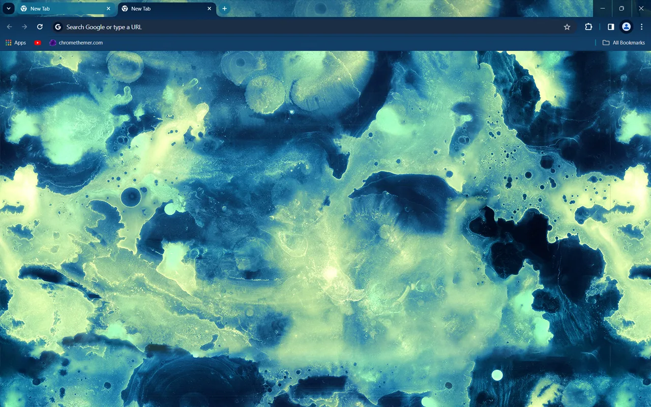
🖌️ About this theme: Watercolor Blue displays washes of deep navy blue and pale yellow-green spread across a textured white background. A navy blue frame surrounds the toolbar and tabs, anchoring the top of the browser window. The fluid watercolor edges spread out naturally across the screen like spilled ink.
👍 Why we like it: The dark navy toolbar provides sharp contrast for active tabs and website icons. Combining deep blue washes with soft yellow-green accents creates an appealing color balance that never feels loud. It is a solid pick for fans of fluid watercolor art.
Active Users: ~2,000 users
12. Hotbox Dark
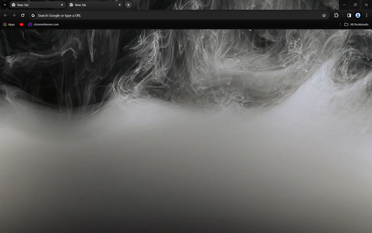
🖌️ About this theme: Hotbox Dark features clouds of white and ash-gray smoke drifting across a solid black background. The tabs, address bar, and browser frame use matching dark tones that blend into the background. The swirling smoke shapes provide soft texture across the middle of your screen.
👍 Why we like it: The dark color scheme cuts down on glare during evening browsing sessions. White smoke curls add visual interest without interfering with bookmark text or search bars. It is a dependable option for anyone seeking a simple smoke-inspired dark theme.
Active Users: ~2,000 users
13. Abstract Pink
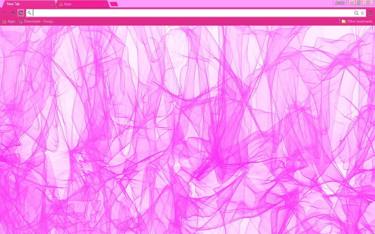
🖌️ About this theme: Abstract Pink displays thin lines of bright pink curling over a white new tab background. The browser frame and tab strip use a rose pink tone that outlines open pages clearly. The delicate curved lines twist across the right side of the screen like fine lace.
👍 Why we like it: The side placement keeps the center of your screen clear for reading and searching. Bright pink lines add a pop of color while preserving an open, light background. It is a great choice if you prefer fine linework over heavy color blocks.
Active Users: ~1,000 users
14. Bubblegum Pop
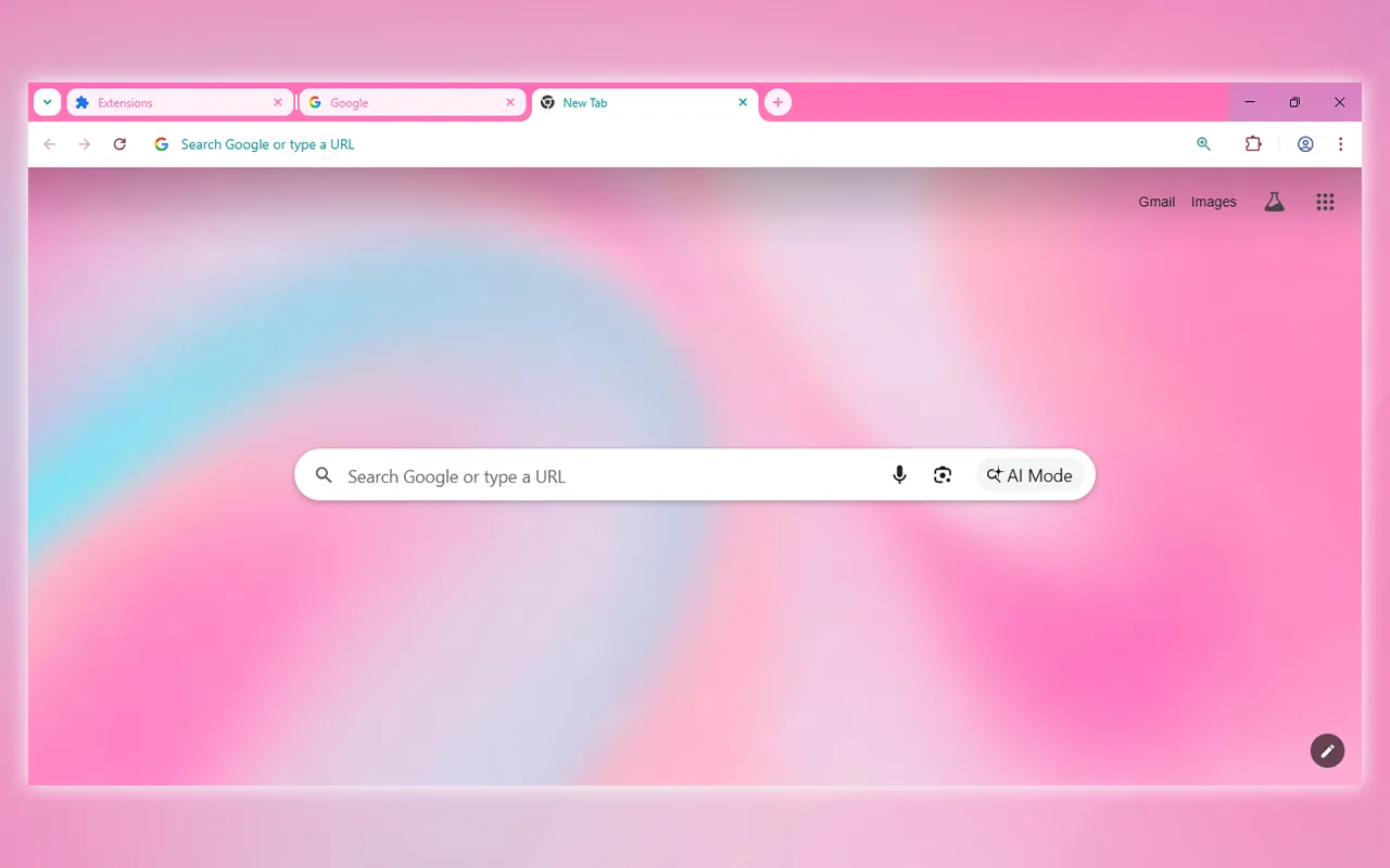
🖌️ About this theme: Bubblegum Pop features broad swirls of soft pink, teal, and creamy white blended across the new tab page. A gentle pink tone covers the tab strip and top frame, giving the entire window a light, playful appearance. The rounded color waves loop smoothly across the center of your screen.
👍 Why we like it: The pastel combination of pink and teal feels lively and clean for daytime use. Tab titles are simple to read against the uniform pink frame. It gives your browser a cheerful pop of color without harsh contrast.
Active Users: ~656 users
15. Soft Pastel Marble
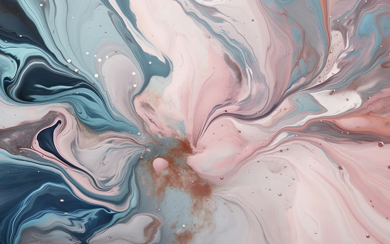
🖌️ About this theme: Soft Pastel Marble features fluid lines of blush pink, blue-gray, lavender, and warm cream swirled together in a classic marble pattern. The browser frame uses a pale lavender tone that matches the soft colors below. The veining spans the full width of the new tab window.
👍 Why we like it: It brings the smooth look of polished marble into your browser with gentle pastel tones. The soft color mix looks clean while keeping all browser controls readable. It is an excellent choice for users who enjoy stone and fluid marble patterns.
Active Users: ~354 users
16. Polygon Abstract
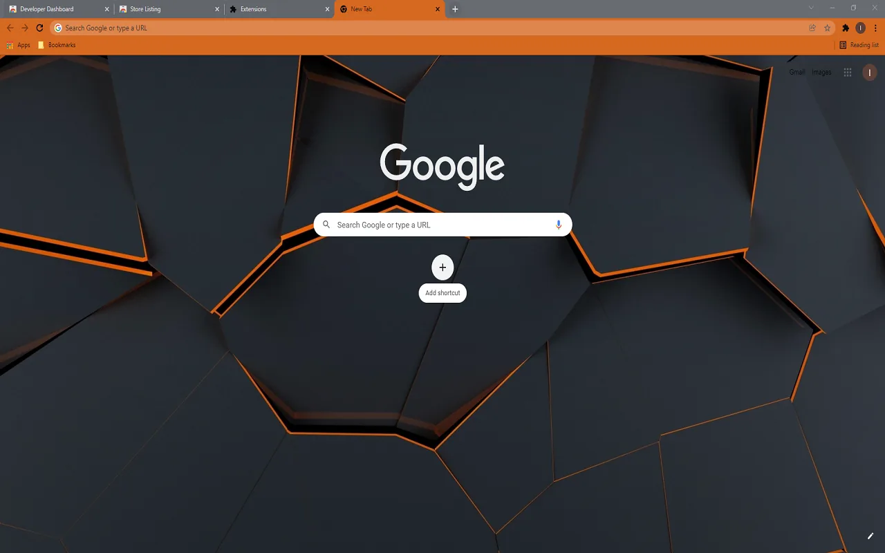
🖌️ About this theme: Polygon Abstract displays dark gray geometric hexagon tiles fitted together in a 3D honeycomb pattern. Thin orange outlines trace each tile edge, paired with an orange browser frame along the top of the window. The angled shapes create a structured grid across the new tab page.
👍 Why we like it: The structured geometric layout provides a sharp, organized appearance that differs from flowing organic themes. The dark tiles keep the main screen easy on the eyes, while the orange accents provide clear visual anchors for browser tabs. It is a top pick for fans of 3D shapes.
Active Users: ~200 users
17. Glass
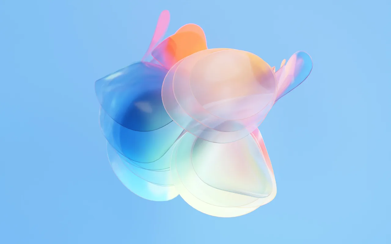
🖌️ About this theme: Glass showcases a curved 3D glass shape centered against a solid sky-blue background. Soft hints of pastel pink, yellow, and mint tint the clear glass folds as light passes through them. The top frame and tabs carry a light blue shade that matches the background surface.
👍 Why we like it: Centering a single glass shape keeps the rest of the new tab canvas clean and free of distractions. The soft pastel highlights inside the clear shape add subtle color without clutter. It is ideal for readers who want modern 3D artwork in a light color scheme.
Active Users: ~142 users
18. Neutral Simple Abstract
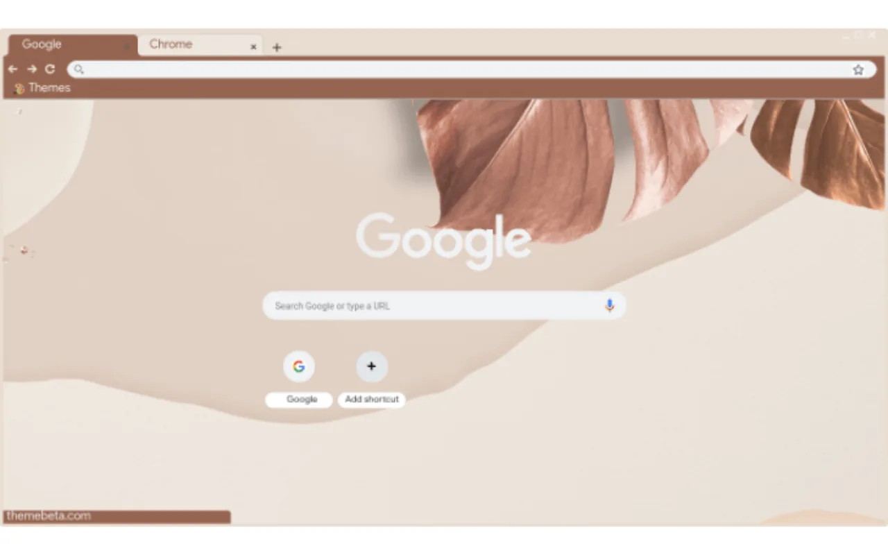
🖌️ About this theme: Neutral Simple Abstract features smooth arching shapes and simple curves in beige, tan, and cream alongside a dried palm leaf. The browser frame uses a warm sandy tone that blends with the earthy shapes below. The layout uses soft neutral colors with plenty of open space.
👍 Why we like it: It offers a warm, earthy color palette that avoids bright colors or stark darks. The gentle curved shapes give the new tab page an artistic feel while keeping web shortcuts easy to spot. It is a great option if you prefer quiet, neutral tones.
Active Users: ~362 users
19. Red and Black Origami
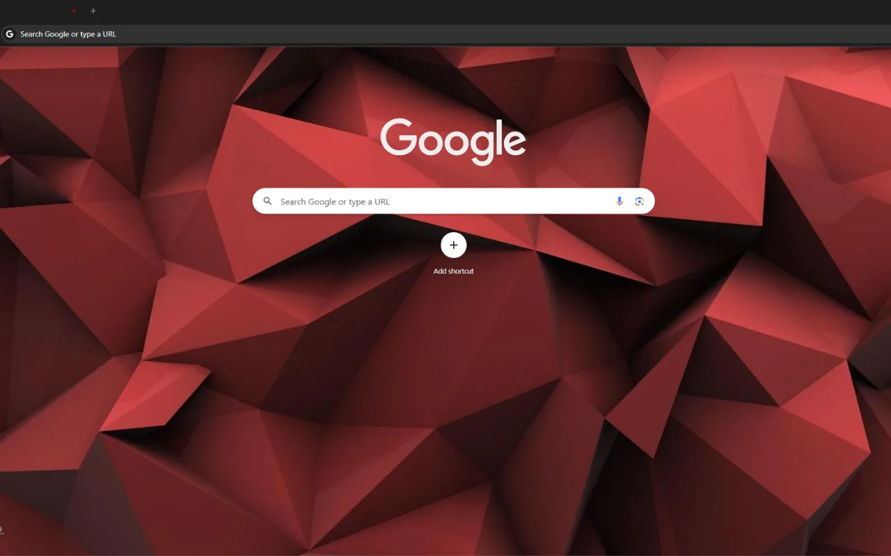
🖌️ About this theme: Red and Black Origami displays folded paper shapes rendered in deep red and charcoal black. The top browser frame uses a dark red shade that frames tabs and bookmarks neatly. Shaded geometric triangles create a clean folded-paper look across the screen.
👍 Why we like it: The folded paper art style brings angular geometric shapes to a bold red and black color scheme. Deep red shades provide rich contrast without creating harsh glare during nighttime work. It is a great choice for users who want dark geometric artwork.
Active Users: ~154 users
20. 3D Browser Theme
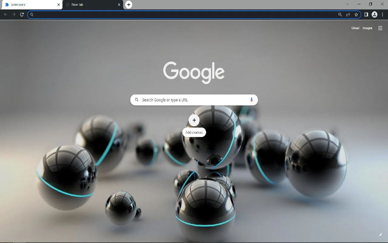
🖌️ About this theme: 3D Browser Theme features smooth black balls with thin teal rings placed across a soft gray floor. A neutral gray frame wraps around the top toolbar, keeping Chrome’s buttons and tabs clearly visible. The rounded 3D objects cast soft shadows that give the scene simple depth.
👍 Why we like it: It closes the list with a simple 3D design that balances dark geometric balls with a calm gray backdrop. The subtle teal rings add just enough color to draw the eye without being distracting. It gives your browser a clean, modern look with clear tab visibility.
Active Users: ~362 users
If you want light colors, try Shaded Purple or Sooth Gradient. For darker styles, check out Dark Harmony or Color Abstraction.
You can also browse our favorite aesthetic Chrome themes for illustrated designs, or try our top minimalist Chrome themes for a simpler setup.