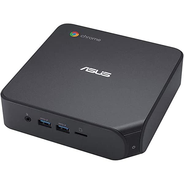
Chrome’s Android navigation bar redesign has too much chrome
 by
Juniya Sankara
September 1, 2026
by
Juniya Sankara
September 1, 2026
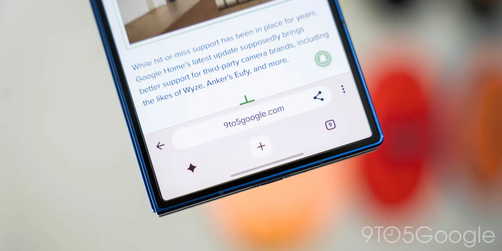
I quite like how Chrome for Android’s main interface has essentially remained the same since 2012. The consistency is refreshing as everything else on my phone changes. While I’m open to modernization, the latest attempt at a redesign suffers from too much chrome.
Remember to like our facebook and our twitter @geekchrome.
Discover more from Chrome Geek
Subscribe to get the latest posts sent to your email.